SANTANAS
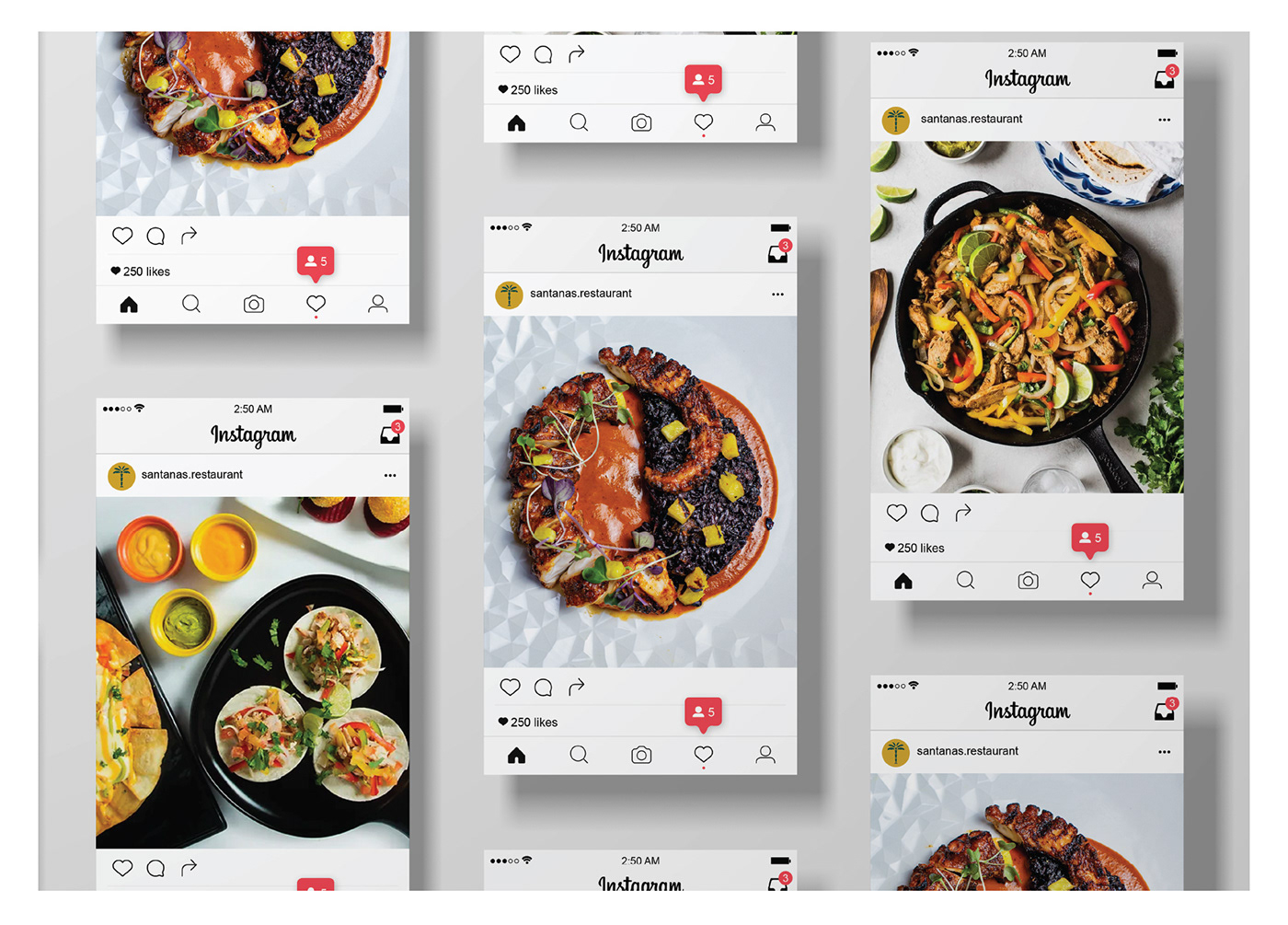
Santanas originally started as a homegrown latin food truck brand in Miami that became so beloved over the years of serving delicious latin foods, that now it was ready to expand into a dine in restaurant space. The couple - Mr. and Mrs Santana, built this brand from scratch and they have a clear goal: To serve delicious Latin food & tasteful signature cocktails and for customers to have a good time at their new ‘home’.
PROBLEM
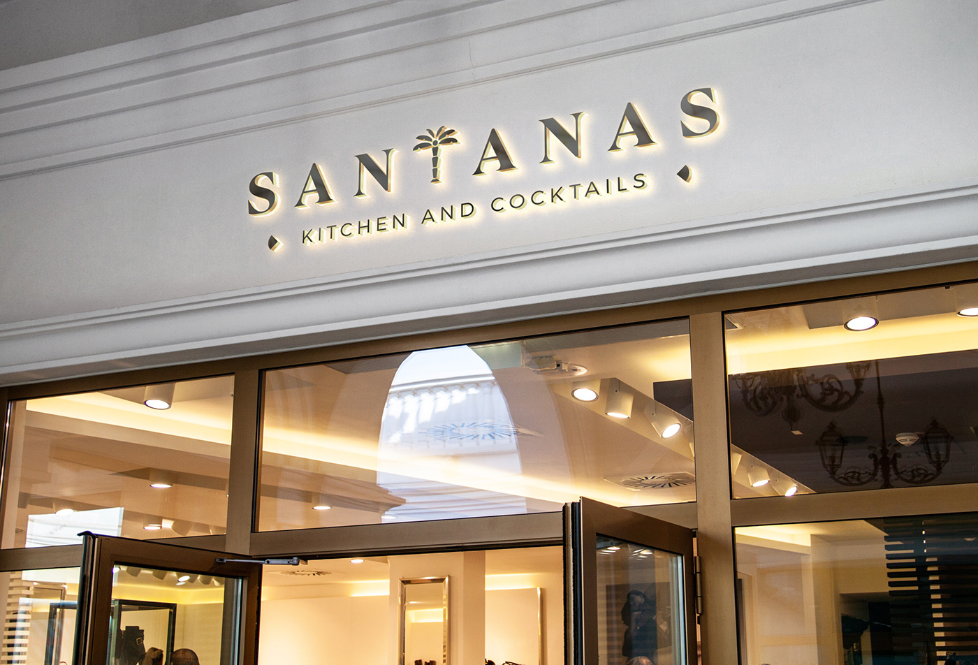
The fact that the brand had started out as a food truck, brought several questions such as, if the brand would be considered premium...or would the brand be even taken seriously as a restaurant? They were also looking to stand out from other latin cuisine restaurants who really didn't pay attention to branding and had a more templated/cartoonish look to their brand. So it was very important for the brand to look classic, elegant, premium and welcoming.
SOLUTION
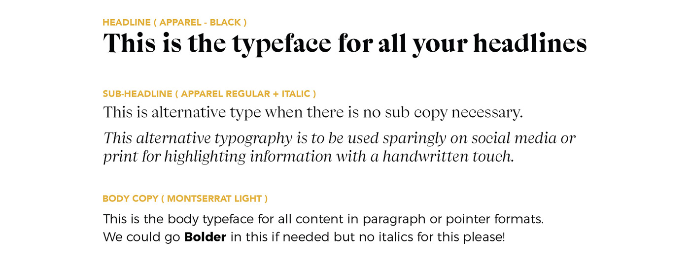
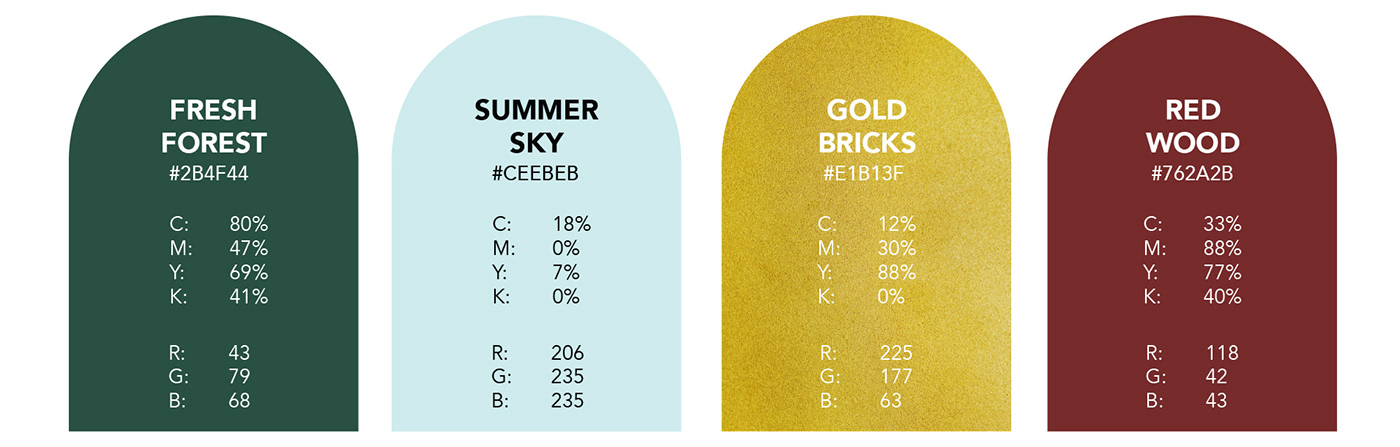
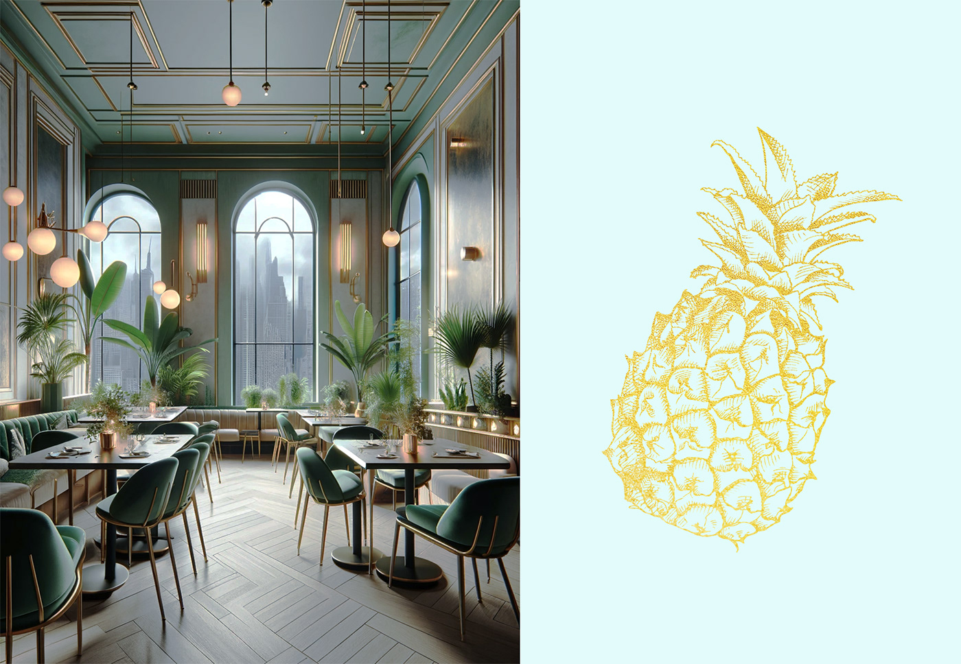
The brief was very clear. We were headed towards a rebrand but we needed to keep the brand essence and its sentiments alive. While it was easy to envision grandeur in the restaurant, we had to keep in mind that the brand needed to seem welcoming even for those with a budget. So our design approach was to provide a clean, minimal style with hints of Art Deco and whole lot of tropical aesthetic which brought the right balance of premium and friendliness to the brand identity.
SERVICES PROVIDED
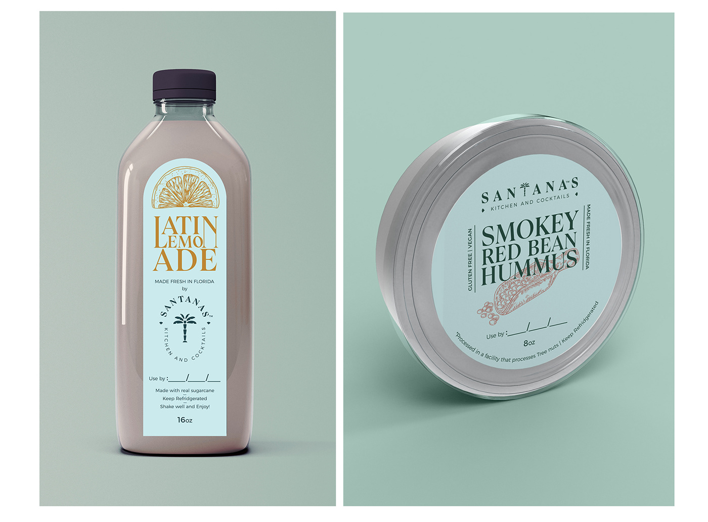
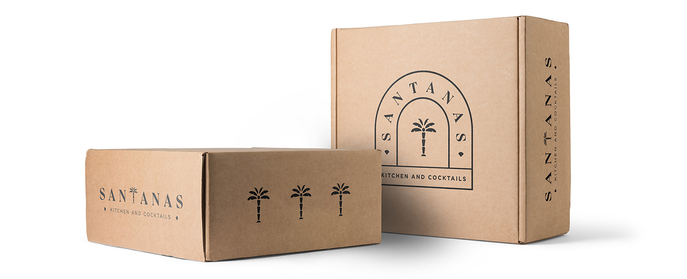
Logo Design | Brand Identity Design | Packaging Design
TEAM
Art and Design Direction, Production, Client Management: JAY DESIGN STUDIO
Logo Design and Production Assistance: Nishit Shah Designer
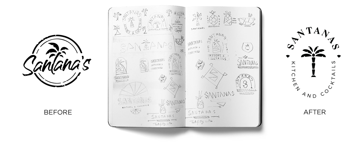
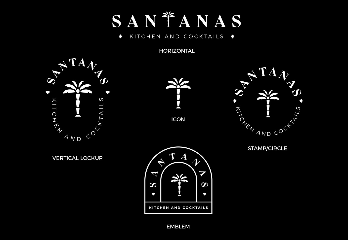
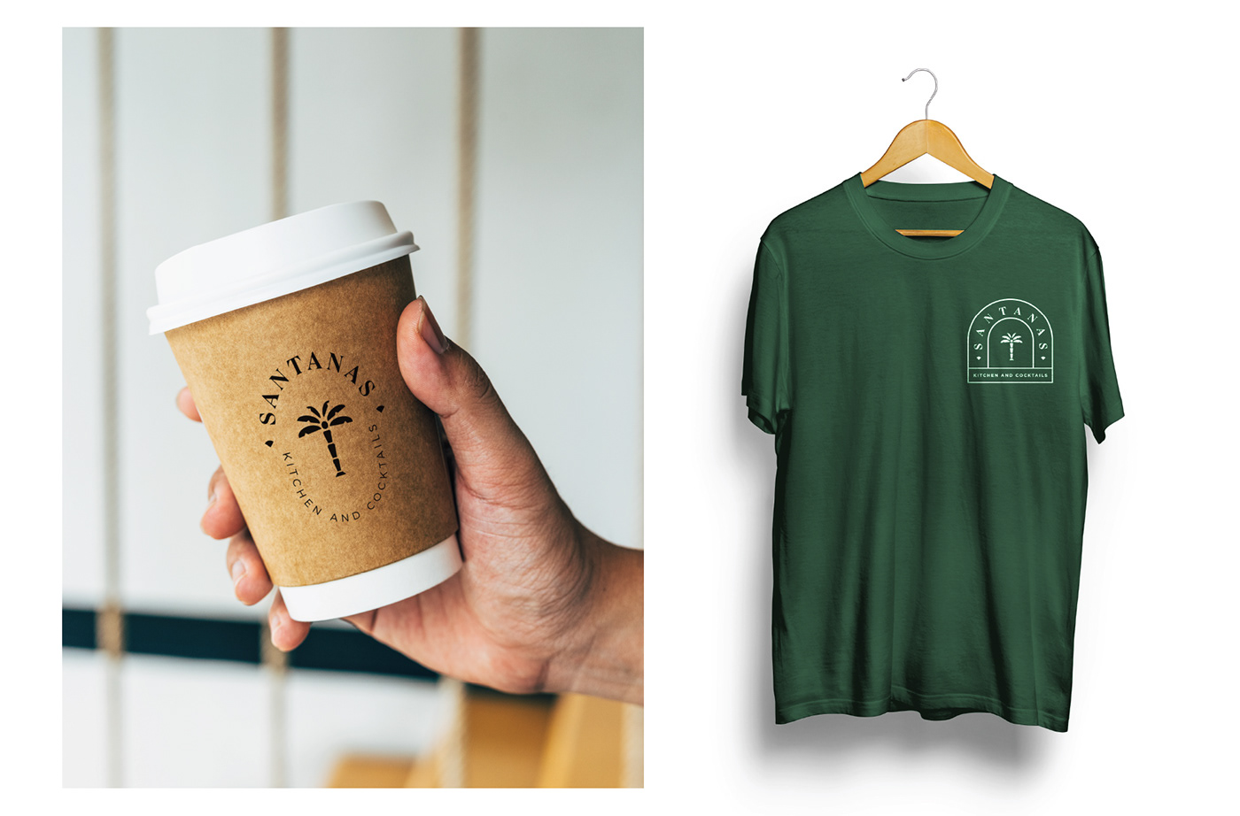
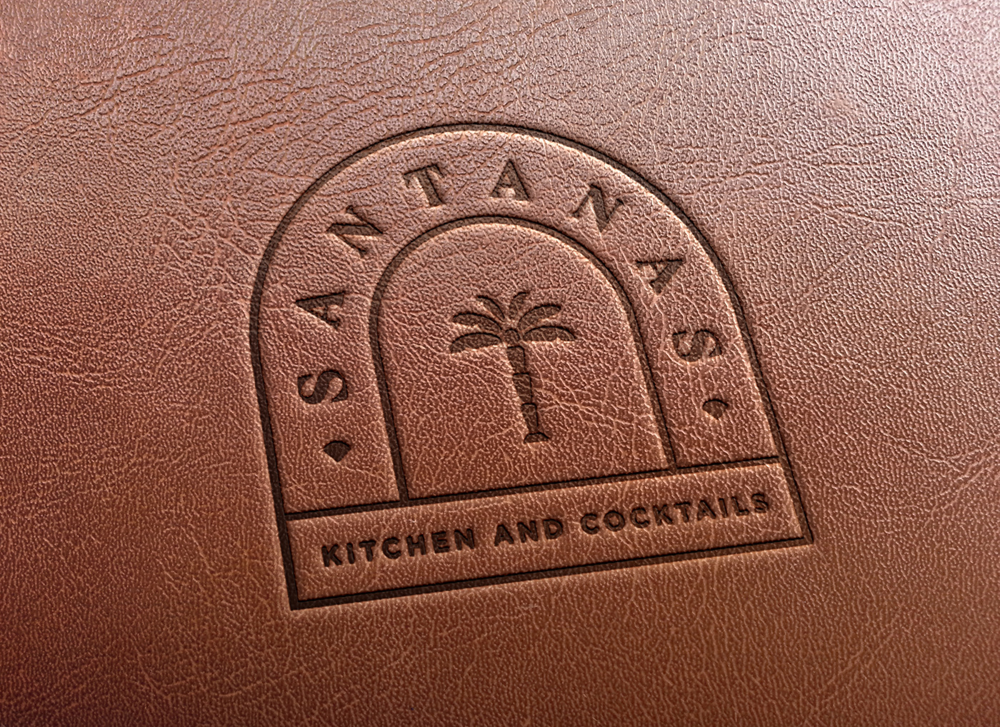
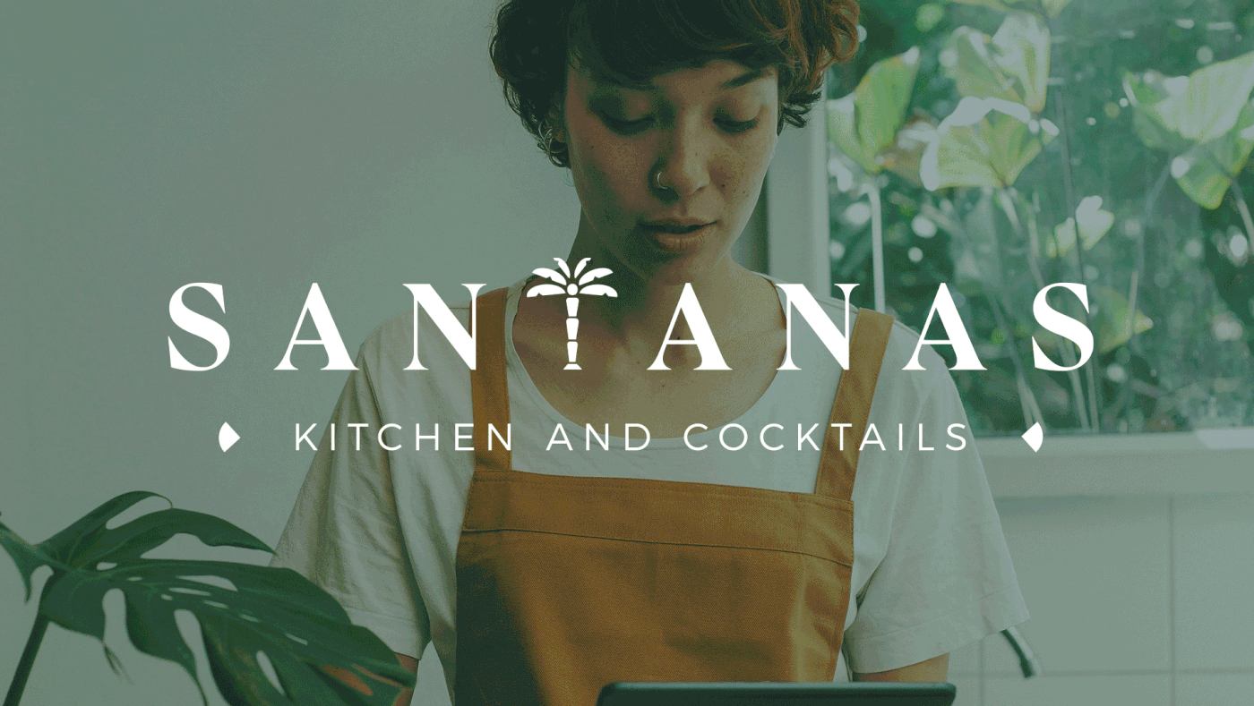
The client really wanted to retain the original essence of the brand but wanted to have an Art Deco style to their new logo because their restaurant interiors would have similar aesthetics. They wanted the identity to look clean, classy and relevant regardless of how the trends keep changing in the industry. So we went ahead with a timeless serif typeface and redesigned the tree to have an Art Deco symmetry to it and retained it in the place of 'T' like they had it in their original logo.
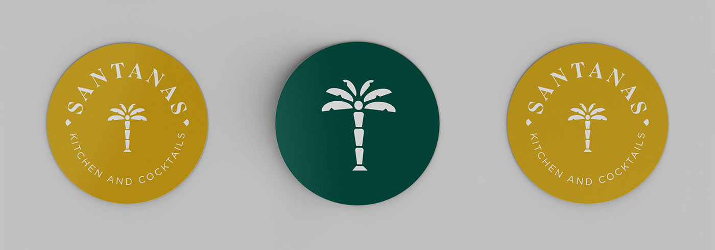
The oval, circular and gilded emblem logo variations were provided to accommodate their sub tagline -
'Kitchen and Cocktails' which were a highly essential part of their new identity.
'Kitchen and Cocktails' which were a highly essential part of their new identity.